Logo / Identity / Audio —
MAAK: A precise identity for high-end audio
A strong identity for audio equipment begins with the same qualities we look for in the object itself: clarity, balance and attention to detail.
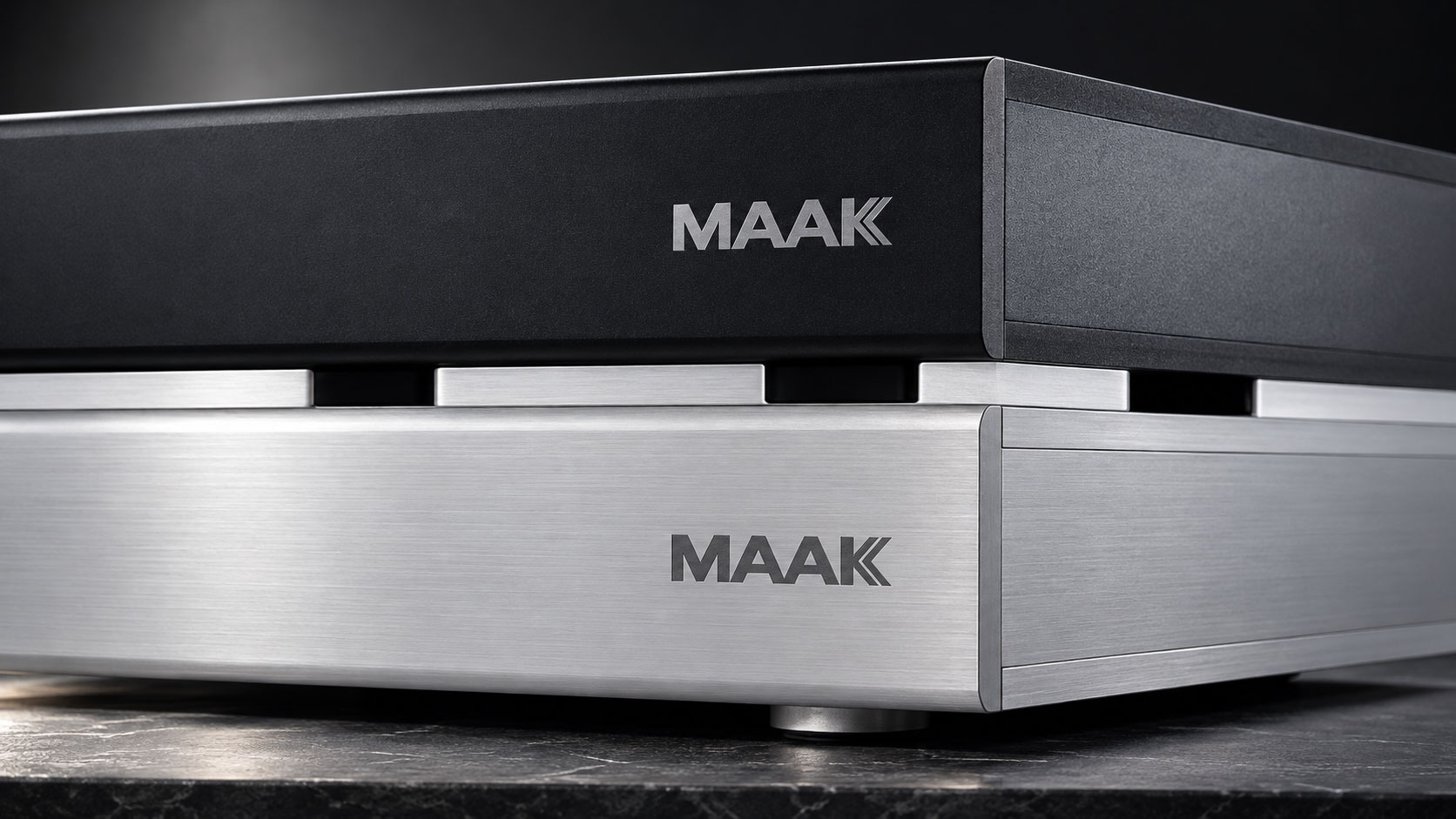
For MAAK, CCVBRAND developed a logo and identity that give the name a clear, confident presence. The design places the wordmark at the centre of the system, allowing the product, its materials and its proportions to remain the focus.
A mark with character
The MAAK wordmark uses bold, angular letterforms and a compact rhythm. The repeated A forms establish a recognisable structure, while the diagonal construction of the K adds a distinctive finish. Its impact comes from the relationship between the letters rather than an added symbol or decorative effect.
On the equipment, the logo reads as part of the object. A restrained black-and-white palette gives it a consistent presence across dark surfaces, light backgrounds and brushed metal.
Precision beyond the logo
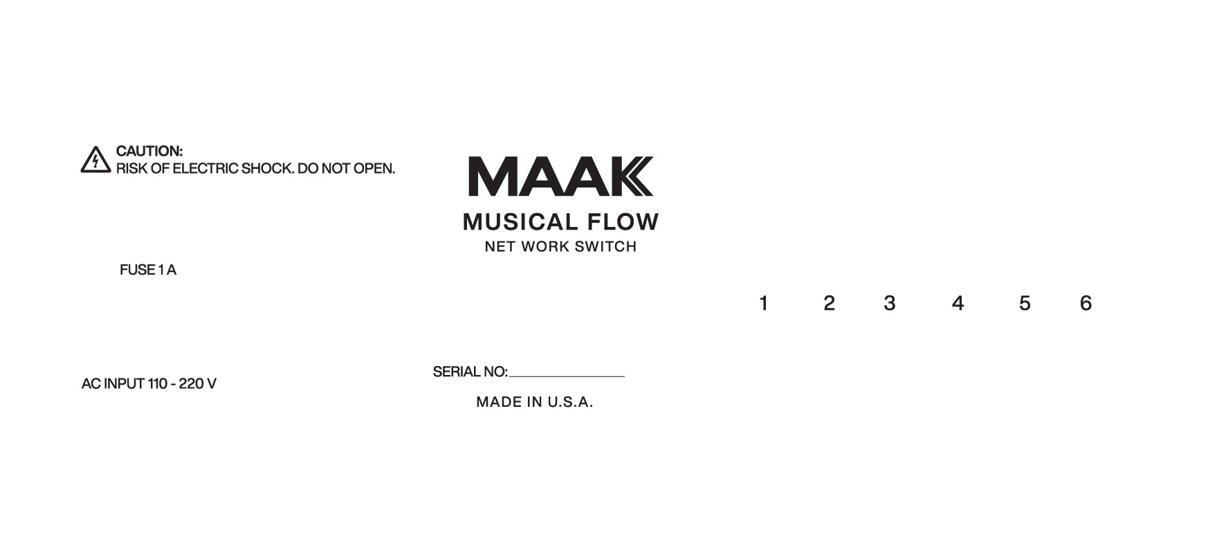
An audio identity has to work beyond the front panel. Product names, connections, power information and technical labels all need a clear visual hierarchy. The identity pairs the expressive wordmark with straightforward typography, measured spacing and an orderly arrangement of information.
The panel artwork shows how these elements can work together: the brand name anchors the composition, the product designation forms a second level, and functional labels remain easy to locate. This is where identity becomes a practical part of the product experience.
A considered expression of quality
For high-end audio, a premium impression does not require visual excess. It can emerge from consistent proportions, legible information and the care with which a mark meets a material. The MAAK identity follows this approach: distinctive where it needs recognition, quiet where the equipment needs room to speak.
The result is a focused visual language designed to support a coherent brand presence across product applications and communication.